

$59.00
See if it's really the one
Search with this product to compare it, find similar styles, or turn up something better before deciding.
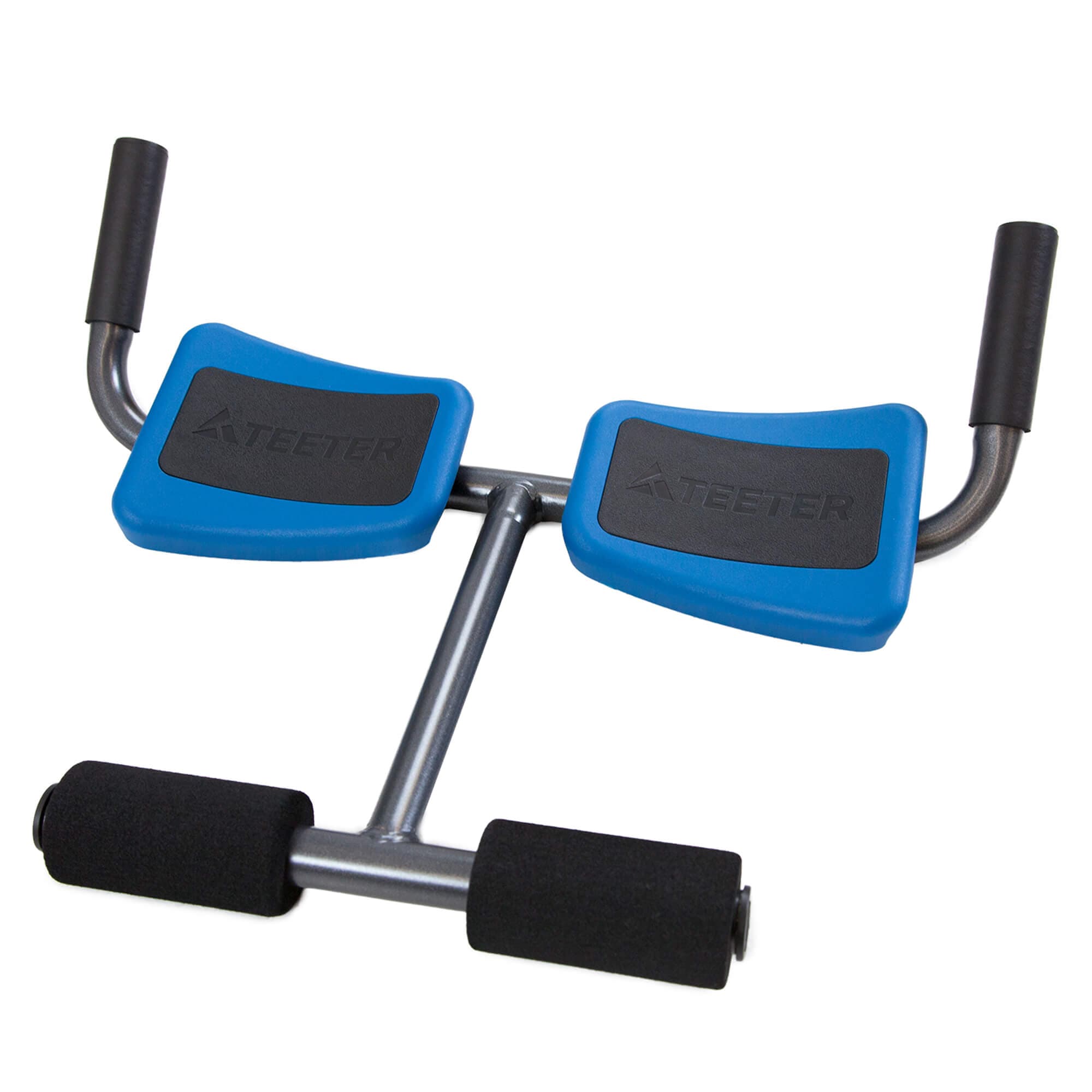
Natural Back Pain Relief Anytime, Anywhere Enjoy easy, comfortable decompression with a lightweight device designed for home, office, and travel. FDA Registered Amplified Decompression 3‑in‑1 Stretch Positions Lightweight and Portable Targeted Relief Made Easy The P2 Back Stretcher makes effective decompression accessible in any space. Its compact design uses the leverage of the foam roller supports behind your legs to amplify your push and create a deeper, more satisfying stretch. You get powerful relief with little effort, whether you are easing morning stiffness or unwinding after a long day. Designed to Last The P2 features durable steel construction with soft, supportive foam elements that create a smooth and comfortable stretching experience. Adjustable lap pads rotate and slide to position securely over the thighs for consistent, targeted relief. Lightweight and travel friendly, it is an easy companion for at home use or on the go decompression. Three Stretch Positions for Targeted Relief Light Stretch Sitting Down Ideal for users with limited mobility or for those seeking a gentle lumbar stretch. Moderate Stretch Lying Down Provides a moderate level of stretch to the lower back area. Deep Stretch Lying Down with Feet Elevated Offers deeper stretch positioning for those wanting greater traction and relief. <!-- --> FREE App to Help You Feel Better and Recover Faster Download the free Teeter Move® ever‑growing library of trainer‑led classes designed to enhance your recovery and boost results – completely subscription‑free. Try for 90 Days If it doesn’t change your life in 90 days, send it back. 5‑Year Warranty Teeter quality backed by trusted warranty coverage. Engineered Fitness Perfecting the details since 1981. Expert Assistance Call, email, or chat with our Teeter Product Experts. #post-29517 .enhanced-content.max-container { max-width: 100% !important; margin: 0 !important; box-shadow: none !important; border-radius: 0 !important; padding: 0 !important; } #product-title-desktop>h1 { max-width: 17ch; } div#p2-intro { background: linear-gradient(180deg, rgb(var(–clr-primary-400) / 0%) 17%, rgb(var(–clr-primary-400)) 27%); position: relative; overflow: hidden; } .p2-intro-background { background: url(‘/wp-content/uploads/2025/12/P2-Back-Stretcher-Living-Room-Lying-Down-1225.png’) 50% 86% no-repeat; aspect-ratio: 5/4; width: 100%; background-size: 132%; position: absolute; top: 0; z-index: -1; } .p2-intro-spacer { aspect-ratio: 125/68; } div#p2-intro .ttr-container { display: flex; flex-direction: column; align-items: center; gap: 1rem; padding: 0rem 2rem 2.5rem; text-align: center; color: rgb(var(–clr-neutral-0)); } div#p2-intro .ttr-header-container h2.sub-heading-3 { color: rgb(var(–clr-neutral-0)); margin-block: 0 .5rem; } .post-content div#p2-intro .ttr-header-container p.fs-body { font-size: var(–fs-md) !important; } div#p2-intro .ttr-header-container h2.sub-heading-2, div#p2-intro .ttr-header-container .fs-body { text-shadow: 0px 2px 4px rgba(0, 0, 0, 0.70), 0px 4px 12px rgba(0, 0, 0, 0.25); } div#p2-intro .ttr-icon-column { display: flex; flex-direction: column; align-items: center; justify-content: flex-start; padding-block: .75rem; } div#p2-intro .ttr-icon-column .icon-box { background-color: rgb(var(–clr-neutral-0)); width: 4rem; margin-bottom: 1rem; } div#p2-intro .ttr-icon-container .sub-heading-5 { color: rgb(var(–clr-neutral-0)); margin-block: 0; } .product.type-product .post-content p.caption-2 { font-size: var(–fs-3xs) !important; } div#p2-intro .ttr-icon-column .caption-2 { margin-top: .5rem; } div#p2-features { display: flex; flex-direction: column; align-items: center; gap: 3rem; padding-block: 4rem 2rem; } div#p2-features .ttr-container { display: flex; flex-direction: column; gap: 2.5rem; padding: 0 2rem; } div#p2-features .ttr-container img { border-radius: 1.5rem; } .p2-features-txt { display: flex; flex-direction: column; align-items: center; gap: 1rem; text-align: center; } .p2-features-txt .sub-heading-3 { margin: 0; color: rgb(var(–clr-neutral-900)); } div#p2-positions { padding: 4rem 2rem 3rem; background: rgb(var(–clr-neutral-100)); margin-top: 3rem; } div#p2-positions h2 { text-align: center; margin-bottom: 2.5rem; } .ttr-container.section-column-3 { display: flex; flex-direction: column; align-content: center; justify-content: flex-start; align-items: center; gap: 3rem; } .ttr-column-container { display: flex; flex-direction: column; align-content: center; align-items: center; } .ttr-column-container img { max-width: 25rem; margin-inline: auto; width: 100%; } .ttr-column-header h3 { margin-block: 2rem 1rem; text-align: center; } .ttr-column-header h3 span { display: block; } .ttr-column-text p { text-align: center; } div#teeter-move { background: rgb(var(–clr-neutral-100)); } div#teeter-move .ecom-enhanced-product-ttrmove { gap: 2rem; padding-bottom: 4rem; } div#teeter-move .ttrmove-product-container { margin-top: .5rem; } div#teeter-move .ttr-move-ecom-still { max-width: 100%; } div#teeter-move .ttr-move-desc-text { z-index: 1; display: flex; flex-direction: column; align-items: center; gap: 1rem; } #ecom-product-enhanced-content-container div#teeter-move .ttr-move-desc-header.sub-heading-4 { font-family: var(–ff-primary) !important; font-size: var(–fs-xl) !important; line-height: 1.25 !important; font-weight: 700 !important; letter-spacing: 0 !important; margin-block: 0 !important; padding-inline: 0; } #ecom-product-enhanced-content-container div#teeter-move .ecom-enhanced-product-ttrmove p { margin-block: 0rem !important; padding-inline: 0; line-height: 1.5; } div#teeter-move .ttrmove-dwnld-container { margin-top: 1rem; display: flex; flex-direction: row; justify-content: center; align-items: center; padding: 0px; gap: 1rem; margin-top: 0; } .ttr-move-desc-text .main-cta { margin-block: 1rem; background-color: rgb(var(–clr-secondary-a-400)); color: rgb(var(–clr-neutral-0)); width: 100%; } .main-cta .fa-circle-play { margin-left: .5rem; } video#ttr-move-app-video { max-width: 100%; position: absolute; top: 59%; left: 44.25%; transform: translate(-53%, -60%); z-index: 1; width: 74.5%; } div#teeter-move .ttr-video-pause { left: -1.75rem; } .product.type-product .post-content p.fs-body { font-size: var(–fs-md) !important; line-height: 1.5 !important; } div#ttr-quality-cs p.caption-1.text-white { max-width: 12rem; } @media (min-width:28rem) { .p2-intro-background { background-position: 50% 122%; } } @media (min-width: 40rem) { #product-title-desktop>h1 { max-width: unset; } div#p2-intro { background: linear-gradient(180deg, rgb(var(–clr-primary-400) / 0%) 31.73%, rgb(var(–clr-primary-400)) 48.93%); } .p2-intro-background { background-position: 50% 70%; background-size: 132%; aspect-ratio: 139/109; } .p2-intro-spacer { aspect-ratio: 139/76; } div#p2-intro .ttr-container { gap: 2.5rem; padding: 0rem 5rem 2.5rem; } .ttr-header-container { max-width: 30rem; } .ttr-icon-container { display: grid; grid-template: auto auto/auto auto; grid-row-gap: 1rem; width: 100%; } div#p2-intro .ttr-icon-column { max-width: 12rem; margin-inline: auto; } div#p2-features { gap: 4.5rem; padding-block: 7rem 2rem; } div#p2-features .ttr-container { padding: 0 5rem; } div#p2-positions { padding: 4rem 4rem 3rem; background: rgb(var(–clr-neutral-100)); margin-top: 3rem; } div#teeter-move .ttrmove-product-container { margin-top: 4rem; } div#teeter-move .ecom-enhanced-product-ttrmove { padding-inline: 5rem; } #ecom-product-enhanced-content-container div#teeter-move .ttr-move-desc-header.sub-heading-4 { max-width: unset; } #ecom-product-enhanced-content-container div#teeter-move .ecom-enhanced-product-ttrmove p { max-width: 30rem; } .ttr-move-desc-text { width: 100%; padding-inline: 2.5rem; } } @media (min-width:52rem) { div#p2-intro { background: linear-gradient(180deg, rgb(var(–clr-primary-400) / 0%) 32.73%, rgb(var(–clr-primary-400)) 60.93%); } } @media (min-width:64rem) { div#p2-intro { background: linear-gradient(180deg, rgb(var(–clr-primary-400) / 0%) 43.64%, rgb(var(–clr-primary-400)) 83.64%); } .p2-intro-background { background-position: 50% 84%; background-size: 125%; aspect-ratio: 8 / 5; } .p2-intro-spacer { aspect-ratio: 10/3; } div#p2-intro .ttr-container { padding: 0rem 6rem 2.5rem; } .ttr-header-container { max-width: unset; } .ttr-icon-container { grid-template: auto/ repeat(4, auto); grid-row-gap: 1.5rem; } div#p2-features { gap: 9rem; padding-block: 7rem 2rem; } div#p2-features .ttr-container { flex-direction: row; align-items: center; padding: 0 6rem; gap: 4rem; justify-content: center; } div#p2-features .ttr-container.img-right { flex-direction: row-reverse; } div#p2-features .ttr-container>picture, div#p2-features .ttr-container>img { width: 100%; aspect-ratio: 128 / 103; max-width: 40.625rem; flex: 1 1 100%; } div#p2-features .ttr-container img { max-width: 40.625rem; width: 100%; } .p2-features-txt { width: 100%; text-align: left; align-items: flex-start; max-width: 34.875rem; flex: 1 1 auto; } div#teeter-move .ecom-enhanced-product-ttrmove { padding-inline: 5rem; max-width: 64rem; margin-inline: auto; display: flex !important; flex-direction: column; flex-wrap: nowrap; align-items: center; justify-content: flex-start; } #ecom-product-enhanced-content-container div#teeter-move .ecom-enhanced-product-ttrmove p { max-width: unset; } .ttrmove-product-container { margin-top: 0; padding-top: 3.5rem; padding-bottom: 3.5rem; } #product-title-desktop>h1 { max-width: 17ch; } } @media (min-width:75rem) { div#teeter-move .ttrmove-product-container { margin-top: 0rem; padding-top: 3rem; padding-bottom: 7.5rem; } div#teeter-move .ecom-enhanced-product-ttrmove { display: grid !important; grid-template-areas: “ttrmove-phone-container ttrmove-logo” “ttrmove-phone-container ttr-move-desc-text”; grid-template-columns: 46% 1fr; gap: 2rem; grid-template-rows: auto auto; padding: 11rem 6rem 0rem; padding-inline: 6rem; max-width: 90rem; } .ttr-move-desc-text { grid-area: ttr-move-desc-text; align-self: start; } div#teeter-move .ttr-move-desc-text { padding-inline: 4rem; max-width: 40rem; margin-inline: auto; } .ttr-move-desc-text .main-cta { max-width: 19.438rem; } div#teeter-move img.ttrmove-logo { margin-bottom: 0; } div#teeter-move .ttrmove-product-container svg polygon { clip-path: polygon(0 35%, 57% 0%, 100% 100%, 0 100%); } } @media (min-width:80rem) { .p2-intro-background { background-position: 50% 88%; background-size: 109%; aspect-ratio: 9 / 5; } .ttr-container.section-column-3 { flex-direction: row; align-content: center; justify-content: flex-start; align-items: flex-start; gap: 2rem; } .ttr-column-container img { max-width: 24rem; } } @media (min-width:100rem) { .p2-intro-background { aspect-ratio: 32/15; background-size: cover; background-position: 50% 75%; } div#p2-intro .ttr-container { padding: 0rem 0rem 2.5rem; } div#p2-intro .ttr-icon-column { max-width: 17.625rem; margin-inline: auto; padding-inline: 1.5rem; } .ttr-icon-container { max-width: 75rem; justify-content: space-between; } .p2-intro-spacer { aspect-ratio: 480/133; } div#p2-features .ttr-container { padding: 0rem; width: 100%; max-width: 90rem; margin-inline: auto; justify-content: space-between; gap: 6rem; } div#p2-features .ttr-container img, div#p2-features .ttr-container>picture, div#p2-features .ttr-container>img { max-width: 46.625rem; } .p2-features-txt { max-width: 37.375rem; } .ttr-container.section-column-3 { gap: 4rem; max-width: 90rem; margin-inline: auto; } .ttr-column-container img { max-width: 27.375rem; } div#teeter-move .ecom-enhanced-product-ttrmove { padding-inline: 0; grid-template-columns: 49% 1fr; } .ttr-video-pause { left: -2rem; bottom: 1rem; } }
Have a question about this?
We currently ship within the US, with more countries coming soon.
Final cost and dates are confirmed at checkout.
🇺🇸 Ship from USA · On Agora since 2026
$59.00